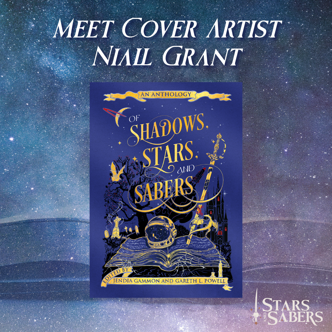
Today we’re sharing a special interview with cover artist Niall Grant, illustrator of the gorgeous cover art for Of Shadows, Stars, Sabers, our 2025 debut anthology, and our second anthology, Of Enchantment, Enigma, and the Infinite! Jendia discovered his art on Instagram (links below) and reached out to contract Niall for the cover art. Read about Niall’s process for creating this cover.
Images and text shared by Niall Grant for this post.
We loved your artistic style at first sight, and found it to be both mythic and lyrical, with a timeless feel as well as modern sensibilities. What were some of your influences?
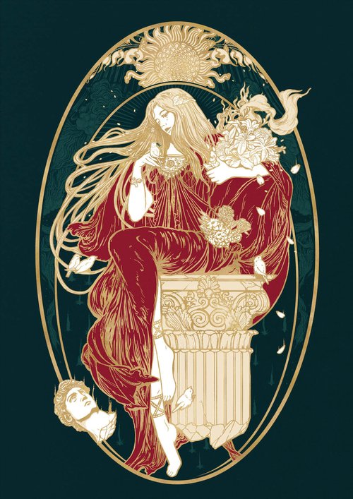
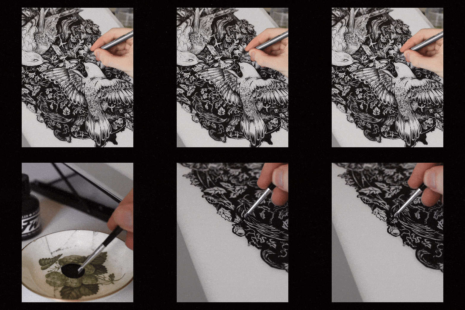
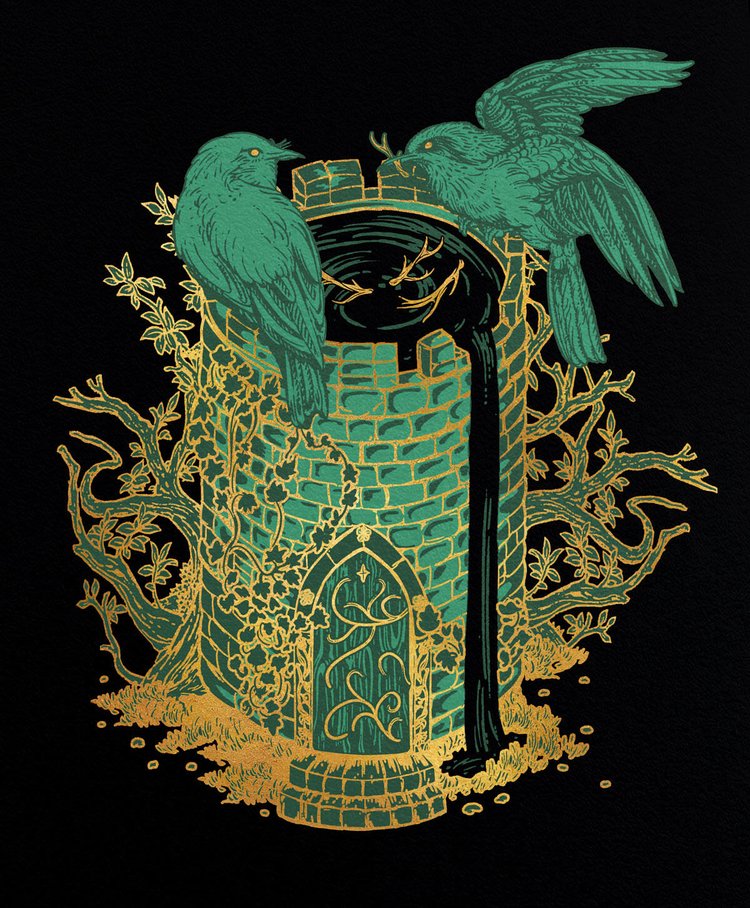
I’ve always been captivated by ink illustrations. My artistic journey began by meticulously studying the line work of renowned artists like Mucha, Rackham, Beardsley, Dürer, and Doré. While some of these artists were also engravers, I discovered that I could achieve a comparable line quality using pen and ink, which felt more instinctively comfortable to me. Additionally, I incorporate gold acrylic and digital techniques to add color to my work. By blending my passion for Golden Age illustration with contemporary methods, I strive to create a distinctive and timeless style of art.
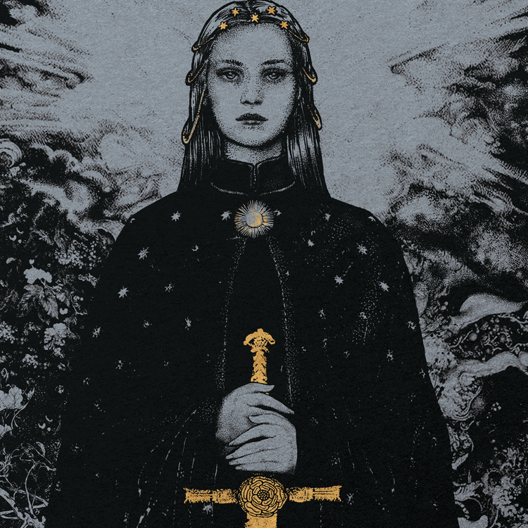
You have worked with many renowned clients in publishing and music. What is the most rewarding aspect of this kind of work?
Some highlights would be seeing my illustrated covers in London’s TATE Modern gallery gift store, and the UK’s #1 bookshop Waterstones. Some notable publishers I have worked with Include Penguin Random House, HarperCollins, Orion books and Hachette.
It’s great to be able to list such prestigious collaborators, but really I just want to work on exciting and meaningful projects to me. I have a strong passion for art, illustration and storytelling. I feel very appreciative that I can work to unite those mediums together.
A very rewarding aspect of my work is the opportunity to bring amazing fantasy stories to life through illustrations. Growing up, I loved immersing myself in other worlds through stories and film. I would draw the characters or what I imagined them to look like. Even though my artistic approach is now quite refined, I still endeavor to approach each illustration with that same youthful imagination.
I also love exhibiting my original drawings and prints when time allows, experiencing people seeing my work for the first time is an experience so fulfilling to me. Everyone is attracted to different aspects of the artworks, and I enjoy hearing people’s interpretations.
With regards to the cover, what was this creative process like? And could you describe some of the design choices you made?
The creative process included taking note of the key themes of the anthology, namely fantasy, sci-fi and horror. This cross-genre approach called for a style that could represent all aspects of the stories. My intuition lead me to the decision that a vintage style book cover with large text would be the best, as it would give a timeless quality to the cover. I created some different moodboards to decide on the best art direction and design approach.
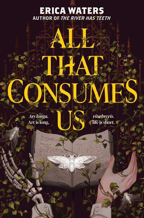
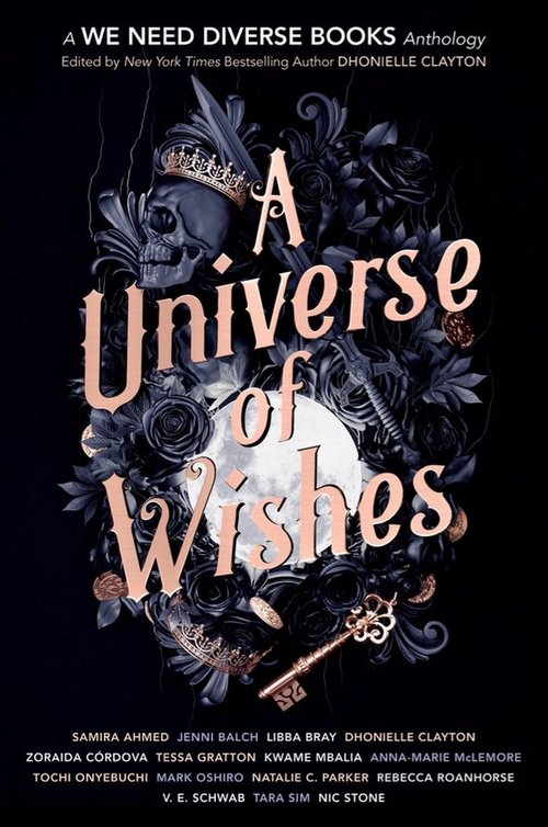
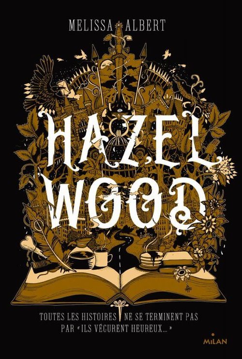
I began with the large, striking text you see on the cover. I sketched the different assets which would adorn the cover. Satisfied with the draft cover, I then redrew everything nearly for the final version. This step of the process calls for a focus on clean lines and a tidy process when separating the colours from the gold outline, as they can often be printed using different techniques.
It’s important to render the gold line work in a balanced fashion; intricate enough to be interesting, yet bold enough to physically print well.
The last step would be to add texture to the colours, and any final touches the image may need.
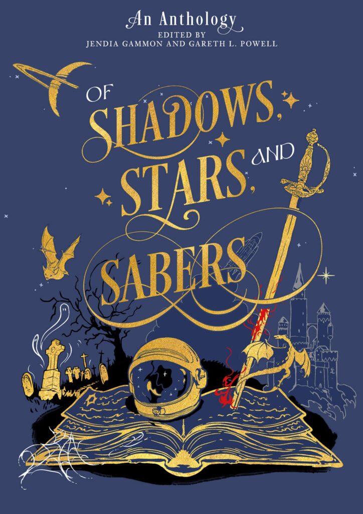
I began with the large, striking text you see on the cover. I sketched the different assets which would adorn the cover.
Satisfied with the draft cover, I then redrew everything nearly for the final version. This step of the process calls for a focus on clean lines and a tidy process when separating the colours from the gold outline, as they can often be printed using different techniques.
It’s important to render the gold line work in a balanced fashion; intricate enough to be interesting, yet bold enough to physically print well.
The last step would be to add texture to the colours, and any final touches the image may need.
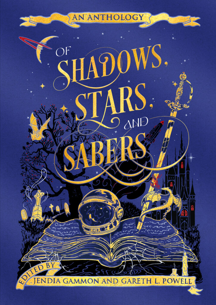
The resulting cover is something that looks quite vintage yet playful, rendered in a timeless style with contemporary techniques. It brings out the features of Fantasy, Sci-Fi and Horror in a balanced fashion, with the central book evoking a sense of literary wonder. It was a pleasure working on this cover, and I hope you enjoy it too.
We are completely delighted with Niall’s gorgeous cover. Thank you so much, Niall, for helping us launch this beautiful book, Of Shadows, Stars, and Sabers, and for helping us build Stars and Sabers Publishing. You are helping to make literary history!
March 1 Update: Niall has also illustrated the exquisite cover for our second anthology, Of Enchantment, Enigma, and the Infinite, which you can see here!
If you’d like to learn more about Niall Grant, visit his wonderful online shop, visit his blog, and follow him on Instagram, Twitter, and Facebook.
Our second anthology, Of Enchantment, Enigma, and the Infinite, features fabulous authors from around the world, writing magical tales that charm, intrigue, or occasionally unsettle! Help support this anthology, which pays our authors and funds book production and shipping, by backing the Indiegogo campaign.
